Conference Stage Layout: What the Set Does to Your Session
TL;DR
- A conference stage layout is a contract. Rows facing a lectern say sit still; chairs angled towards each other say a conversation is coming.
- Size the screen from the furthest seat, keep the bottom of the image clear of the heads in front, and stand downstage, not behind a lectern.
- Four panellists in a line behind a long table reads as a tribunal. Angle the chairs, drop the table, move the moderator to the audience end. Cabaret seating costs roughly half the room’s capacity.
Most briefs treat conference stage layout as a diagram the AV company will sort out. It is not. The set decides who can see, who can hear, who feels invited to speak, and how far the host must travel to reach a human being. I have hosted 800+ events, and the layout is usually settled before anyone asks what the session is for.
What does a conference stage layout actually change?
It changes what the room thinks it is allowed to do, and venues say so in their capacity guides.
Oxford University Venues describes theatre layout, rows of chairs facing the front, as suiting events where the audience watch and listen with minimal participation. Its U-shape entry is for sessions where all individuals need to participate. Cabaret sits between: people face the front but also talk in groups of six to ten.
So a layout is a prediction. Build rows and you have predicted silence. If the agenda then asks for questions, you are fighting your own floor plan.
Lectern, armchairs or standing: which stage layout suits the slot?
Match the furniture to the job, not the speaker.
| Set-up | Best for | What it costs you |
|---|---|---|
| Lectern | Scripted addresses, announcements, data-heavy keynotes | Fixes the speaker in one spot and hides half their body |
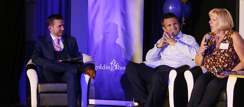
| Two or three armchairs | Interviews, fireside slots, informal Q&A | Low chairs drop the energy and hide faces from the back |
| Standing, no furniture | Keynotes with movement, hosting, game segments | Nowhere to put notes, nowhere to hide nerves |
A lectern is not neutral. The UK’s Approved Document M treats it as an access issue. Paragraph 4.9 asks for good sight lines and careful placing of lecture equipment, including the demonstration table, lectern and projection screen, so patterned walls, poor lighting or bright back-lighting do not get in the way. Paragraph 4.12 adds that where a podium or stage is provided, wheelchair users should reach it by ramp or lifting platform.
Armchairs have one failure mode worth naming: deep seats tip people backwards, so the face angles at the ceiling and the voice goes with it. Firm chairs at normal height keep faces readable.
Where should the screen go?
Where the furthest seat can still read the smallest thing on it. Everything else about screen placement is secondary.
AVIXA’s DISCAS method sizes the image from the farthest viewer distance and the height of the smallest element on screen, with an acuity factor of 200 for general viewing and 3438 for analytical content. It also bounds the horizontal viewing area with a line 60 degrees from the perpendicular of each image edge: the polite way of saying the far side seats are not watching your slides.
Height matters as much as width. DISCAS works with an image offset, the gap between the bottom of the image and the viewer’s eye height, and treats the closest-viewer calculation as undefined once that offset drops below half the image height. In a flat-floored hall that is row six, watching the bottom third of every slide through somebody’s hair.
Two placements survive a real room: one screen centred behind the stage with the presenter beside its edge, or twin screens flanking it.
Sightlines, access and the seats nobody checks
Sightlines have a number attached. Auditorium designers use the C-value, the vertical distance between a spectator’s eye and the sightline of the person behind and above. On a flat floor it reaches zero within a few rows, which is why stages exist.
Fire guidance shapes the floor. The Home Office guide to places of assembly asks for at least 305mm of clear space between fixed seat rows, gangways of at least 1.05m, and no seat more than seven from a gangway.
Approved Document M is specific about wheelchair spaces: 1% of total seating up to a capacity of 600, 900mm of clear access, and spaces giving a range of views at the sides as well as front and back.
Two things get forgotten until the morning:
- Light on the speaker’s face. RNID’s communication tips are to face the person and be well lit, with no light source behind you. A window or an LED wall behind a presenter silhouettes them and takes lipreading away.
- Somewhere for a BSL interpreter. The National Deaf Children’s Society notes one may be on stage, on a platform among the audience, or on a large screen by the stage, with seating reserved so people can see them.
Where should the host stand?
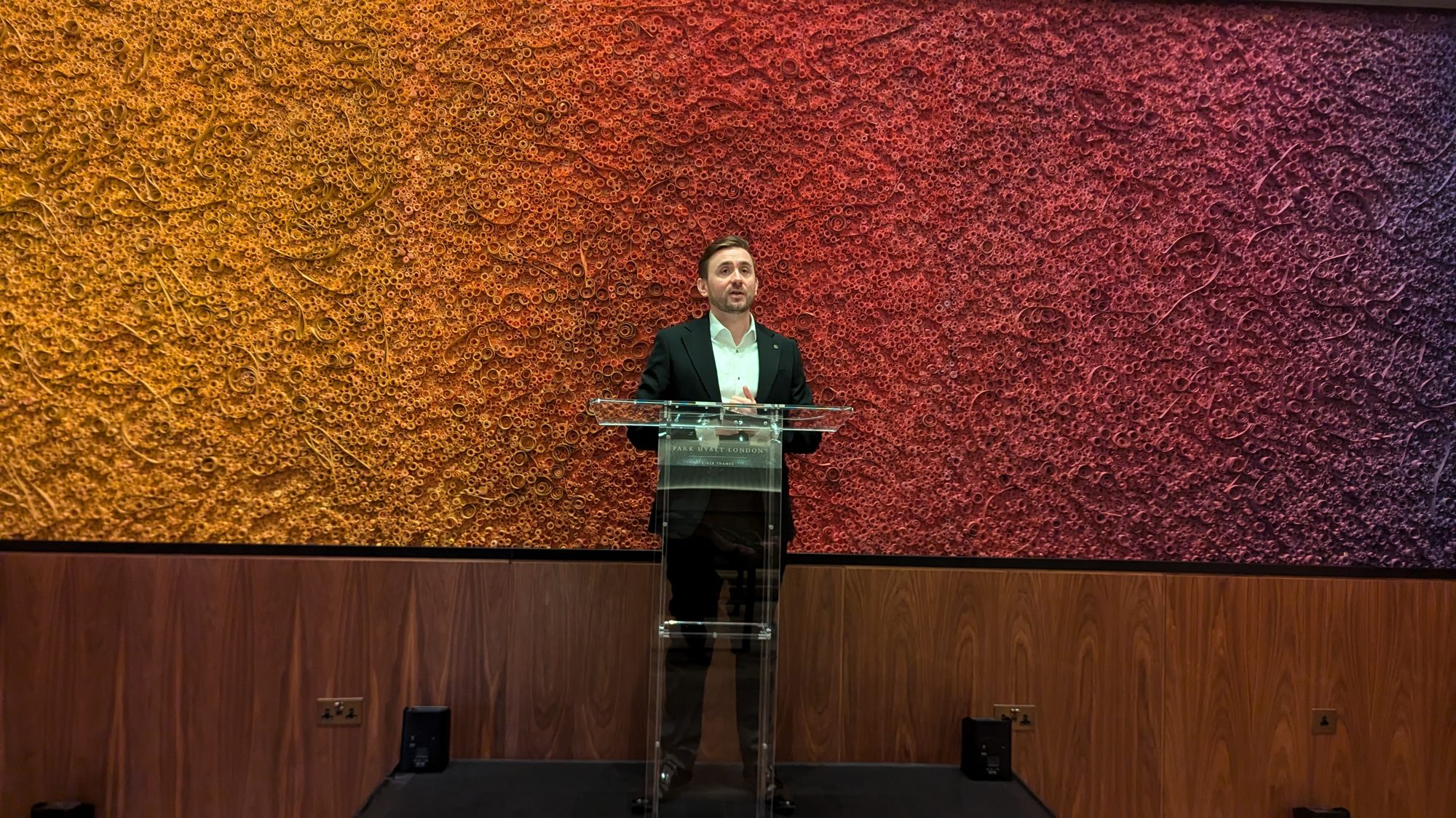
Downstage, off-centre, and closer to the audience than feels comfortable. Where you stand is the cheapest way to shorten the distance.
Edward Hall’s distance zones put public speaking in a close phase of 12 to 25 feet, with the social zone at roughly 4 to 12 feet. A host at the back of a deep stage is beyond 25 feet from the front row before a delegate has spoken. Step to the lip, or off it, and the exchange moves into social distance, where a question feels like a conversation rather than a performance.
Everything I know about reading the room depends on seeing faces, so light the audience and put nothing between you and them.
How do you set a panel so it does not look like a tribunal?
Break the straight line. Four people side by side behind a long draped table, all facing out, is the visual grammar of a hearing, and the room reads it before anyone speaks. Four fixes:
- Angle the chairs into a shallow arc so panellists see each other without leaning forward.
- Lose the long table, or use low side tables. A table across the front hides gesture and gives everyone something to hide behind.
- Put the moderator at the end nearest the audience. The middle chair looks like the judge.
- Cap it at three or four. Five across a stage is a line-up.
Same instinct as a roundtable discussion, where round is the point. The rest of the craft sits in how you moderate a panel.
The distance problem in a wide room
Wide rooms are worse than deep ones, and more common, because hotels sell square footage. A hall 30 metres wide with the stage on the long wall puts two blocks of delegates outside the screen’s 60-degree viewing area and side-on to every speaker.
Fixes, roughly in order of cost: move the stage to the short wall; add side screens with a camera feed; or pull the seating forward and curve it towards the stage.
The RAF Museum’s London capacity chart lists its Historic Hangars at 800 theatre style against 360 cabaret. Oxford’s Sheldonian falls from 717 theatre to 80 cabaret, because the seating is fixed.
Which layouts quietly kill audience participation?
The ones that remove eye contact. Rows and distance do most of the damage, and neither shows up on a plan.
In The Psychologist, one researcher compared a semicircle with rows and columns. Marx and colleagues found children asked more questions in the semicircle, and in the author’s own study with older students on-topic discourse almost doubled. Sitting at the back of a large hall, the article notes, reduces eye contact with the speaker and makes two-way interaction less likely.
Two layouts that look fine and perform badly:
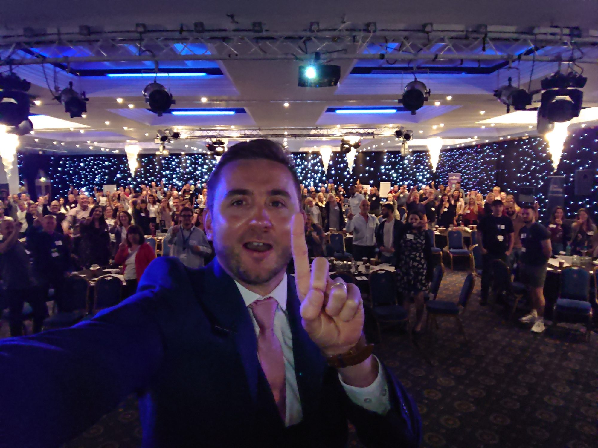
- Theatre rows with nobody in the front two, so the nearest human is 10 metres away. Or a high stage with the house lights down, where nobody can see a hand go up.
- Cabaret with ten chairs to a round table. Two or three have a shoulder to the stage all session.
After twenty years watching the energy in rooms, my view is simple. Most participation formats fail at scale because they were built for twelve people in a training room, not a hall of hundreds. Professional adults take part once the format removes the risk of looking foolish. That is why I run Q&A and whole-room games through delegates’ own phones, on my own software, RoomReader, included with the hosting: it reaches row 30 as well as row 2. The layout still has to let me see faces, which is most of holding attention.
A conference stage layout checklist for the walk-through
Do it from the stage, then from the worst seat.
- Can you read the smallest text on screen from the furthest seat and both outer corners?
- Is the bottom of the screen above the heads in row five?
- Can a wheelchair user reach the stage, and can everyone see the interpreter?
- If you asked for a question now, which seats could catch your eye?
Fix the failures before the chairs are bolted down. The layout is the one part of the day you cannot adjust on the fly, and how you open a conference depends on what the room has been told to expect.


17:00Close
Send me your agenda. I’ll show you where the room comes alive.
A fixed price, a free planning call, and a reply within one working day.